Solstice Spiked Seltzer
Branding and Web Design
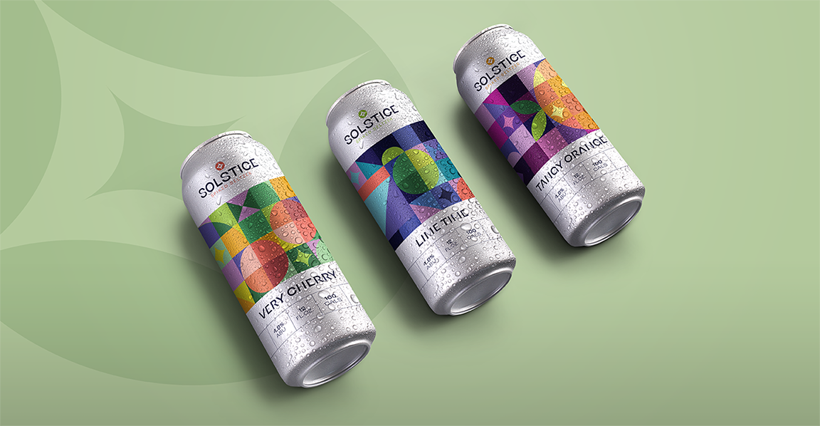
Solstice is a spiked seltzer concept that has a unique style that would set itself apart from other spiked seltzers on the market. The visual style is influenced by mid-century modern artworks and design as well as looking to tiles and mosaics for other geometric designs. The logo was inspired by a tile pattern that creates a star-shaped pattern encompassed by circles, intended to represent the sun. Each flavor has its own label with a tile-like pattern with a fruit hidden within the grid of colors. Along with the packaging of the cans, the brand has its own one-page scrolling site to advertise the drink and assist customers in finding the drink so they can try it for themselves.
Tools Utilized: Illustrator, XD, Photoshop
Logo Process

Moodboard
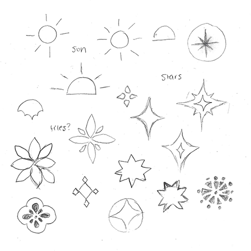
Logo sketches

Final Logo
Can Designs


Final Website


Other Designs
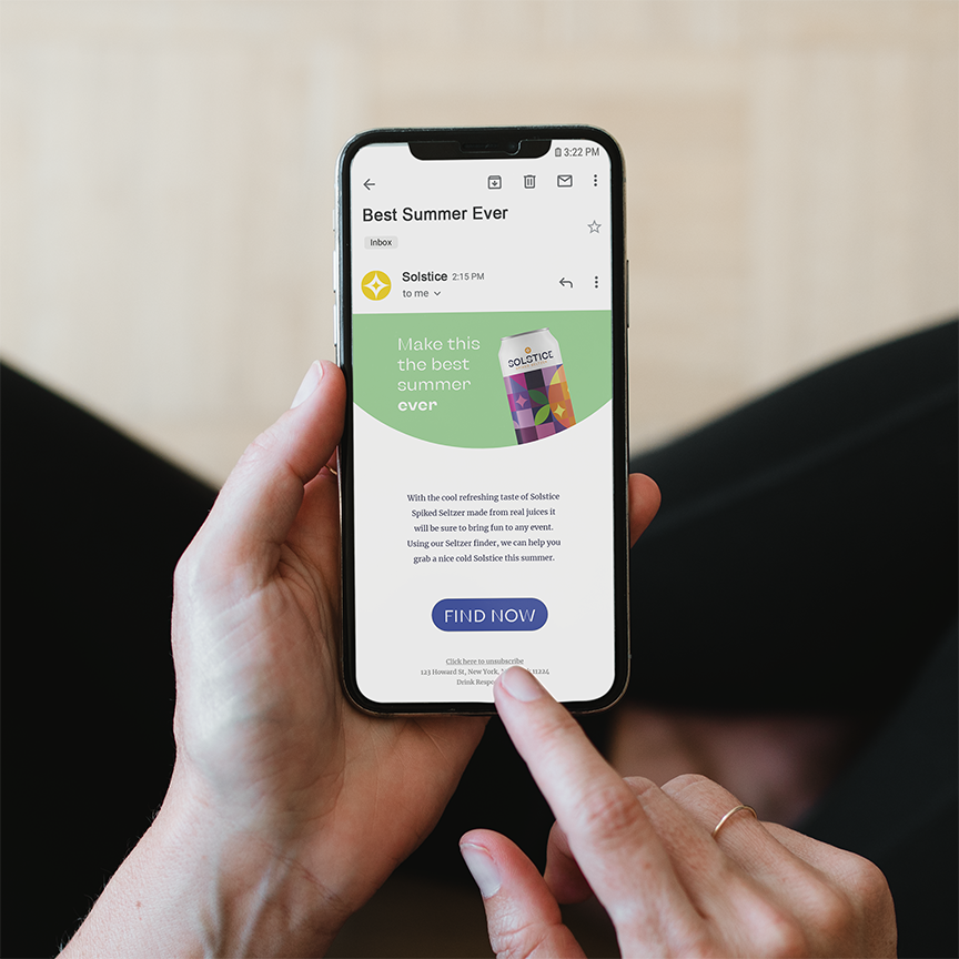
Email Flier

Coaster